Starting with the Italian bible, in a previous post I asked the question of why has this book been rebound with these two sections in particular. Without looking closely at the pages themselves, it could be supposed that when the bible was originally taken apart, it was one section of pages bound together and was placed as one piece into the new binding. When you take a closer look at the pages, on the bottom of one you can see that “omib” is written there. On the next page, the first word in the text is “omib”. This shows us that they were not originally part of the same signature, or group, of pages. The originally book binders would have used the “omib” written on the bottom of the page to make sure that the pages were in the correct order when the signatures were bound together to make the bible.

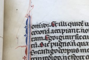
This tells us that the dealer who cut up this bible decided that binding together Corinthians I and II together would be attractive to future buyers. The person who rebound this book made that choice to make it more attractive to future buyers than each one separately would be.
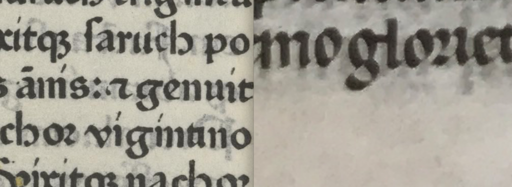
This book is a manuscript, or written by hand. This can be determined from the ruling lines that stretch across the page where the text is. The ruling lines are there for the scribe to write on to keep the text in a straight line. If this bible were printed, the ruling lines would not be there because they are not necessary. This dates the bible to a different time than what is written on both the inside of the cover and the notecard of information found inside the cover. I did some research comparing the Italian bible in the collection to the bible that the book dealer thought that it came from. The book dealer thought that it was part of a 48-line bible printed in Mainz by Johannes Fust & Peter Schoeffer in 1462. When I compared the two, I saw some very large differences. For example, there is a distinct difference between the fonts. This is most easily seen when in this picture comparing the g’s in the printed bible, which is on the left, and the manuscript on the right. The letters in the printed bible are more block-y and not as slanted and close together as they are in the manuscript.
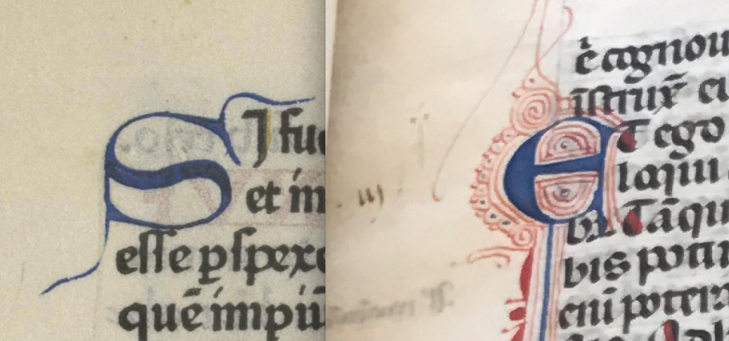
We can also see the differences in the printed bible and the manuscript by looking at the initials. The printed bible, on the left, has much more plain initials and does not have the decorative swirls that are present in the manuscript.
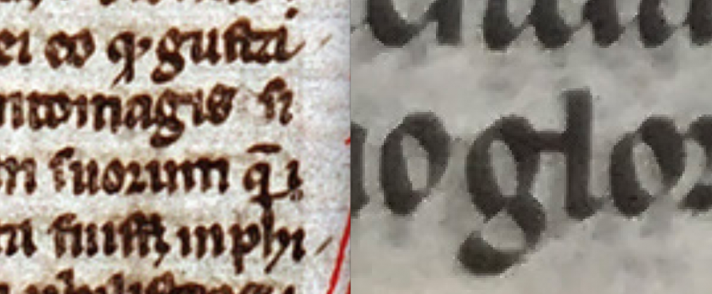
After comparing the Italian bible to the printed bible to determine that it is not a printed bible from the 15th century, I compared it to other manuscripts from Italy to try and match it to a time period. When I compared it to a manuscript from the 1300’s that is also from Italy, I saw many similarities. You can see the similarities in the letters, but especially the g’s. They are both slanted letters written in very similar, if not the same, Italian Gothic rotunda script. This evidence goes against the claims written inside the book that it is from the 15th and 16th centuries and shows that it could be from the 14th century.
Transitioning from the Italian Bible to the Plaskitt Bible, I wanted to talk about the chart I found at the back of the book that lists different bibles and the prices for them.
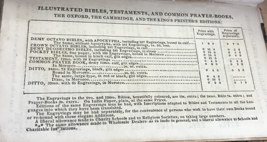
From this, we can determine that this type of bible was mass produced by the authorized publishers, as this is a King James Bible, and that a separate company added the engravings in later. We can affirm this by looking at the pages with the engravings. One of the pages with an engraving is shorter than the rest. This must have happened when the bible was rebound with the engravings.
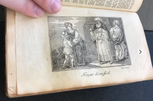
When checking out the chart at the back of the book, we can determine which bible this is and how much it would have originally cost. When I counted the engravings, I found that there were 169. This identifies this as the pocket edition of this bible that is made of fine paper, bound in black calf, and has gilt edges. This bible was definitely originally black, but faded to a brown color over time.