Christina’s Page
1) Page Descriptions
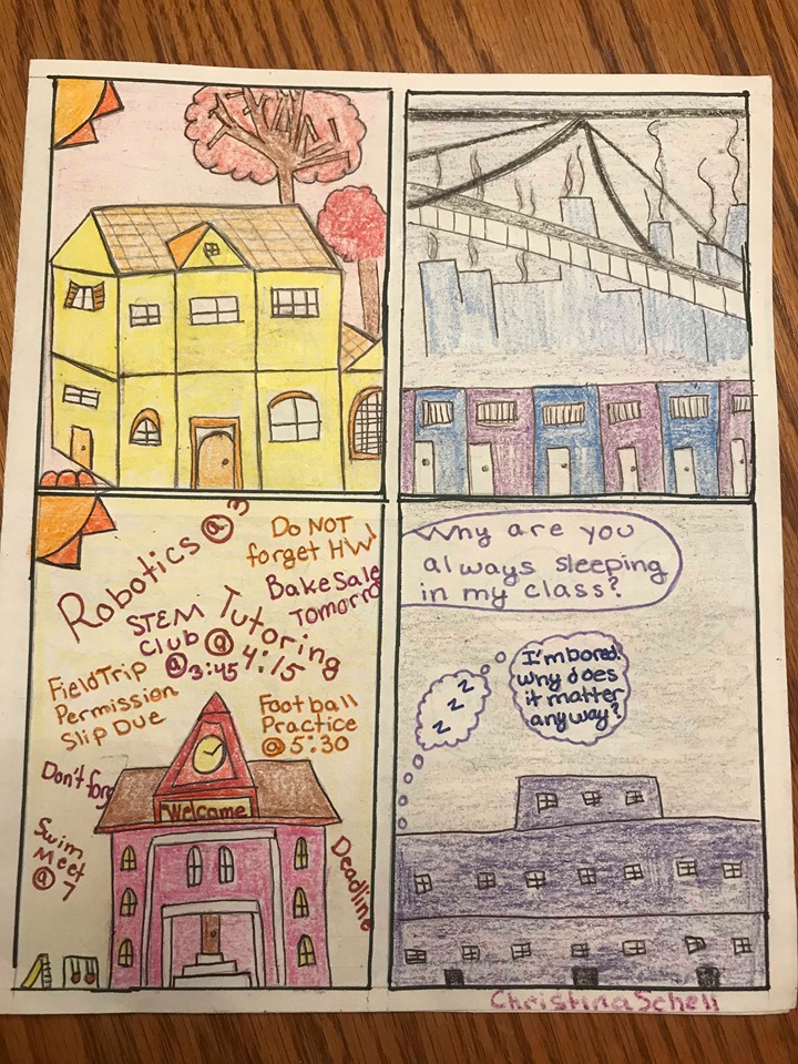
Page 1
On page one of my comic, the page is broken into two sides. On one side, the reader can see the home and school of a wealthier student and on the other side the reader can see the home and school of a student with less monetary wealth. The color schemes for the wealthier child’s setting are red, yellow, and orange because these colors create a bright yet hectic feeling for the reader. The setting for the student of a lower monetary class has somber blues, grays, and purples, as this student has a less exciting and gloomier lifestyle.
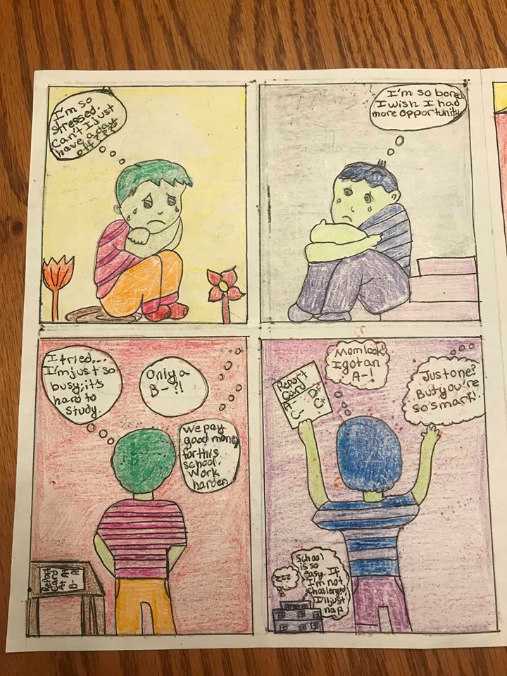
page 2
On page two, one student from the wealthier class is stressed and overwhelmed by his academic expectation and overload of extracurricular activities; his parents have high expectations because they sent him to a great school. The next student is bored because of a lack of opportunity and his parents are surprised to see he is not reaching his full potential even though he is very intelligent. For this page, I made both of the children green with either green or blue hair because I did not want to add a race to these children, as any child could be encountering these situations and all children deserve compassion.
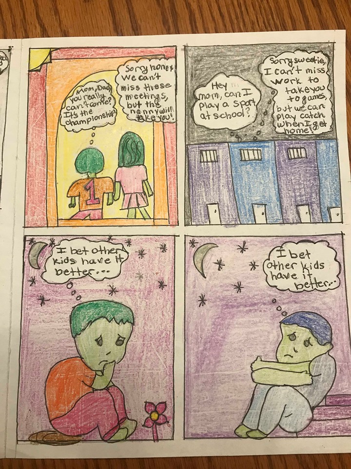
page 3
Page three shows one student going to a sports game without his family’s support, as the nanny takes him instead and his parents must go to a business meeting. Meanwhile, the other child wants to play a sport, but his parent can’t afford to miss work to take him. One stylistic choice I made here was to have the children sitting as if they are looking into a mirror as they say that they think other children have it better; I made this choice because both the children are struggling, just in different ways.
2) One idea that I incorporated from class was the concept of a divide between classes. I thought it would be interesting to show this divide from a new perspective. Usually, we focus on the student who has a lack of opportunity. I chose to compare two children who are both struggling in two very different ways. One student does not have social and academic opportunities and feels depressed while another student has too many social and academic opportunities and feels overwhelmed. The goal was to show the truth that all children of all classes are similar in that they need love, support, and opportunity even though they are living two different lives. I tried to convey this theme by utilizing color. One of the children lives in a bright yellow, red, and orange setting while the other lives in a blue, purple, and gray setting. The bright colors represent the hectic life of the overwhelmed child while the purple hues represent the gloomy life of the child without enough opportunity.
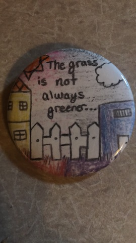
3 ) I chose to create a button to go along with my comic book. The button shows the two homes of the two little boys in my comic but could also represent two different homes of other children in similar living environments. Between the two homes on the button, I drew a fence. The fence represents the divide between the classes. I chose to incorporate a play on the phrase “the grass is always greener on the other side” by changing the saying to “The grass is not always greener on the other side.” I chose this phrase because the children in my comic are both struggling and think the other has a better life when, in reality, both children have challenges to face and their challenges are just different form one another’s.
Hi Christina!
I loved reading your comic! I believe that I understood the main message that you relayed. To begin, I liked the use of color in your comic. You utilized what we learned in class to enhance your comic in that way. To me, color became a symbol in this comic because you were using the comic to portray emotion such as blue and purple for somber emotions. I think the ethical spectacle was really portrayed clearly. I also really liked how you used the fence to symbolize the class divide on your button. As you mentioned, the main theme/message from your comic is social class. Both children grew up in different social classes, but they are still struggling with their own unique set of challenges. For the wealthier kid, he is struggling because he was given so much and his parents except so much from his as a result of that. The poorer child is struggling because he does not have as many opportunities as the other child. However, both children yearn for more attention and recognition from their parents. The wealthier kid’s parents are always busy upholding their status in the community and at his school while the less affluent child’s mother is really occupied working to provide for her son. It just shows how many areas a child needs to prosper. A child cannot just get an education, they also need to receive the affection that parents can offer. I think you did a great job at capturing the humanity in both children.
Hi Christina! I really enjoyed your comic, it was very well-rendered and the symbolism was strong. The thing that spoke to me most was the use of color in your comic. The red/orange/yellow life of the child really does give the feeling of intensity, stress, and overwhelming feelings that the child faces. These colors match the situation of the child. I think the blue/purple/gray color scheme truly embodies the sad, underprivileged life of the second child. Additionally, I really liked your stylistic choice of not including race in your comic to emphasize the fact that these two situations can occur to any child regardless of race. Class is always a difficult subject because it is both connected to and separate from race. Sometimes we overgeneralize and see race and class as equal, but fail to see that class categories are often more pertinent in educational situations and availability of resources than race categories are. Your comic succeeded in making readers think about what should be done about making schools equitable to all students regardless of class. Great job!